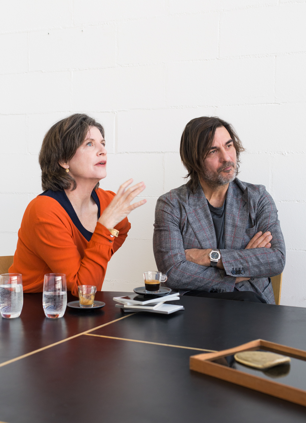
Coffee with Hella Jongerius and Massimo Orsini
at Mutina HQ Fiorano Modenese
Conversation with Annalisa Rosso Photography Matteo Pastorio

-
ARIt looks like you’re having fun.
-
HJIt’s very serious fun though!
-
ARWas it like this the first time you met? You were already working on colour when Massimo called you.
-
HJI received this phone call and I thought, “Why not? Let’s meet up.” I was expecting one person and he arrived with the whole family! In the end there were lots of people sat around the table and we had a pleasant conversation. But I needed to see whether we had the right chemistry. That’s why I didn’t immediately show him the ceramic project I have been working on for some time now, layering colour over clay. After some time, I began to feel at ease and to think it was the right company. I decided I could share what I had done. I showed my work to Massimo and he really liked it, he said it was exactly what he had been looking for. It was a natural, cerebral encounter.
-
ARMassimo, were you expecting to find a project that was well underway?
-
MOWe are big fans of Hella, as I’m always telling him. We’ve been following him closely for years. We have a clear policy here at Mutina: we don’t want to work with lots of designers. Better to keep it down to just seven or eight designers with whom we can construct a solid and lasting discourse. I had Hella in mind for some time because, in a certain sense, he was the only one missing. He closes the circle, completing the group that we have created. I asked my close friend Ronan Bouroullec – who is also part of this team – to introduce us. When we went to Hella’s studio in Berlin and saw his amazing work, it was the exact opposite to what usually happens. No other designer has ever greeted me with such a developed and in-depth study of material and colours.
-
HJRonan is part of my very small circle of trusted designers. He told me that I could trust them and that it was a good group, suggesting that I give it a go. And I listened to him.
-
MOIt was a very important encounter for me, I have become very close to Ronan and we have spoken about Hella a lot. In the end, when I decided to ask for his help, he replied “Why not?” and it was all very simple. Mutina’s motto, which is borrowed from Milton Glaser, is ‘You can only work with people you like’. That is fundamental for us. It is not solely about professional ethics, but personal contact and a certain way of seeing things.
-
ARHow do you feel now that your work has become a finished product, Hella?
-
HJIt’s not finished! (laughter)
-
ARNo?!? That’s interesting!
-
HJIt is, in a certain sense: part of my work is now a complete project. But what I like about the tiles is that you can use them in so many different ways. There are endless options. People are free to choose from the panorama that we have created and composed. We could expand this range, so people can make their own composition however they like. The product is half-composed of the chosen textures, it then comes to life thanks to the clients, the interior designers and architects. They can all decide which language fits them best. That is what I love and, in that sense, the project will never be finished.
-
ARYou are essentially giving others the chance to work on your project. I have often had this feeling about you.
-
HJYes, it’s something that I particularly like. I get scared when things start to grind to a halt.
-
ARI imagine you also get bored easily.
-
HJVery easily. But there’s something else too: I don’t believe in the truth. When you come to a final, complete result, you achieve a sort of truth. And I don’t believe that a single, flawless truth can exist. That is why I like working on long studies and leaving room for the different possibilities that emerge. Even if I am making a sofa, I will still use lots of different textures. The sense of truth in closure scares me.
-
ARI see similarities with Mutina here too. Every time I think I’ve got the company figured out, something new surprises me.
-
MOAnd we are undergoing great changes once more. Because we are working with colour for the very first time with Hella. There are yellows, greens and many more. We have always used neutral shades in the past: grey, black and white. I feel comfortable exploring this new territory with Hella. I feel relaxed for the first time in my life. Shall we make a yellow? Let’s make a yellow! He has a great sensitivity toward colour, which was fundamental in getting this new exploration started. And I hope this is only the beginning of our collaboration, because there is still so much to do. If Hella agrees, that is… (laughter)
There are endless options. People are free to choose from the panorama that we have created and composed. We could expand this range, so people can make their own composition however they like.

-
ARColour is energy to me, it is a physical sensation. Hella, why is your work so concentrated on colour?
-
HJColour is a material to me. As an industrial designer, I realised that I wouldn’t be able to use all the tones I wanted to, in the way an artist does, because the palette used in the industry is very limited. It is stable, it doesn’t respond to light. I wanted more. I wanted to bring quality back to the world of colours for us designers. It is like a soup: it will be much better if you make it with 20 excellent ingredients. Industrial design thinks too small. If they want something to be darker, they use black. Green and black, for example. But if an artist wants to create a darker green, they use red! The result is a richer colour. As an industrial designer, I have to make peace with the fact that it won’t always be easy to achieve this level of colour. That is why I work so intensely with colours: I want to change their quality, I want them to breathe with light.
-
ARA sort of statement.
-
HJYes. Colour is not the last element to be added to a product. It is a material. Let’s look at it in a different light. In the food industry, people stopped eating anything that was too salty or too sweet at some point. People were no longer interested and that’s when organic food came along. That is what I am hoping for, that people understand how things could be and we liberate the colour sector. That is my mission.
-
ARA splendid mission.
-
HJI think the same way about imperfection (he picks up an irregular plate, Ed.). Look. Now we know how beautiful this object is, but 20 years ago, when I brought up imperfection in ceramics, people were horrified and thought it was something only an artist would do.
-
ARPerhaps it is a question of control. People fear imperfection and colours. If everything is the same, neutral and regular, perhaps that is calming. But choosing is harder, we are not that accustomed to having freedom of choice.
-
HJIt is true that people are scared of choice, but I think we have created a palette that will make them feel safe. It is not infinite. In the colour range that I have chosen, anything you create will be beautiful and pleasant. Human ability has got lost in industrial process, and I would like to recover it. My entire study is developed around a topic that I believe to be important, and now an industry has taken that and inserted it into the real world, we can start to think about changing things. Not in my studio. But with a product that exists on the market and which people will pay for: this is how change happens. That is what I am hoping for.
Colour is a material to me. As an industrial designer, I realised that I wouldn’t be able to use all the tones I wanted to, in the way an artist does, because the palette used in the industry is very limited. It is stable, it doesn’t respond to light. I wanted more.
-
ARHella, you use words with the same conscious freedom as you do colours. Massimo, how will you explain this new project to your clients?
-
MOThis is the first time we have moved towards colour, but we are doing it in a pleasing and natural way. That is how I will explain it. We needed Hella to do this. When we arrived in his studio, there were so many different tiles and colours. We chose quickly and lucidly. It was wonderful seeing him work. It is not at all easy to work with colour and make it into something beautiful. There were contrasting shades and we were at a loss. But he has this amazing ability to move things about without thinking too much and everything is right.
-
ARTell us about the final result, the Diarama collection, for example.
-
MOWhen I say that the production process naturally opened up to colour, it is because we have chosen natural clay bases to which the same enamel is applied. We use seven different clays but keep the colour of the enamel the same. The change in colour is determined by the play between materials, the interaction between the changing base and an unchanging colour. It is clear which base is which because each tile has a strip of clay in the middle to contrast with the shiny surface. The bases in the shades chosen by Hella reacted completely differently to the enamel, creating a palette of colours that we didn’t expect. Hella made the decision about what to keep and what to eliminate. It was very interesting being a part of this work, which surprised us because we never imagined yellows, blues or greens like these. It is coherent with Hella’s work, the ceramic work that he has been working on for years. A very natural way of doing things. For the Eclipse collection, we used different layers of colour in the same way artists do.
-
ARHow did you choose the colour range?
-
HJOn the basis of the reaction with the clay tile. Not all the bases reacted well with the layer of enamel. So, we looked at the results and selected the two components that mixed best.
-
ARIt is an experimental, empirical approach that is very much your style. This is an age in which most designing is done on a computer from beginning to end. Yet you try things out to assess the results.
-
HJIt is something that you can’t design. Do you need a yellow? Here’s a yellow. It works so we’ll keep it. It doesn’t come from the head, but from the eye.
-
ARIs it a question of instinct or practice?
-
HJLet’s say that I have an expert eye.
-
ARDo you have the perfect eye in the same way that people have perfect pitch in music?
-
HJNo, not perfect. Just a very well-trained eye. That makes it easier for me, while many people are very scared of colour.
-
ARWhy is that, do you think?
-
HJI think because we were educated as modernists. So, we are still modernists, in a way. We are afraid of decoration.
I think that very few people know how to use colour well. In general, when they imagine a house, they imagine it in white or grey. It is more relaxing. Then there are a lot of terrible ways to use colour.
-
MOI am afraid.
-
ARYou admit it?
-
HJYes, I know you’re afraid (laughter)
-
MOI think that very few people know how to use colour well. In general, when they imagine a house, they imagine it in white or grey. It is more relaxing. Then there are a lot of terrible ways to use colour. But then you encounter one of those rare people who works well with colour. I wasn’t afraid with you, Hella. But in general, there are more terrible results with colour than beautiful.
-
HJIt is the modernist tradition still looming over us!